The finish product of my music video uses conventions of real music products and challenges them.
Tuesday, 28 February 2012
Monday, 20 February 2012
Sunday, 12 February 2012

Saturday, 11 February 2012
Friday, 10 February 2012
Critical theory
Audience theory
There are three theories of audiences that we can apply to help us come to a better understanding about the relationship between texts n audience.
1 The effect model or the Hypodermic Model.
2 The uses and graphications models.
3 Reception Theory.
Why do audience choose to consume certain texts?
There are three theories of audiences that we can apply to help us come to a better understanding about the relationship between texts n audience.
1 The effect model or the Hypodermic Model.
2 The uses and graphications models.
3 Reception Theory.
Why do audience choose to consume certain texts?
- Interested
- Bordem
- Popular
- The consumption of media texts has an effect or influence upon the audience
- It is normally considered that this effect is negative
- Audiences are passive and powerless to prevent the influence
How?
- Social Networking
- Magazine
- TV
What happens when they consume text?
A model of media
TEXT AUDIENCE INSTITUTION
-Website -consume the text Examples of institutions
Newspaper - Disney
Radio - BBC
TV - ITV
Advert Magazine - Warner Brothers
Film
Computer games
Role of INSTITUTIONS
Produce
Promote
Advertise
Distribute
Exhibit
Link between Audience ------ Institution
- Financial Transaction
Thursday, 9 February 2012
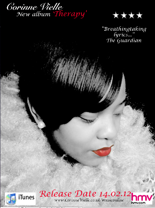
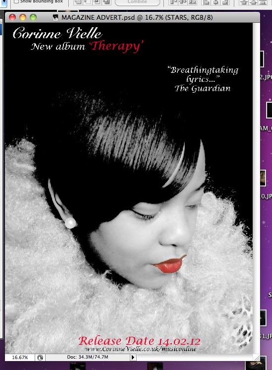
Progress when producing magazine advert
We learnt that in order for us to get an image like the rating stars/ hmv logo and itunes icon to move from google onto our magazine advert, we had to save the images on to the desktop by print screen the images using Cmd, shift and 4 on the imacs. We then opened the images on to different layers on photoshop so that we are able to open them independantly and pressed a dragging tool to highlight the image, then cmd and c to copy the image, we then pressed the a moving tool and cmd and v to paste and drag the image onto the magazine advert and were able to move them independantly depending on the layer that was highlighted.
Wednesday, 8 February 2012
Process of producing Magazine advert
After doing my magazine analysis this morning this afternoon, we decided to use out album cover for our magazine advert and have all the information including:


- the artist name
- the name of the album
- the release date
- where it will be available (HMV) (ITunes)
- the website
- rating stars
We made text box's on photoshop to add the above information. Each time we added a new bit if information, we had to add a new layer so that we could move the information around independently.

In tomorrow's lesson, we are going to add in the ITunes , rating stars and HMV icons as we ran out of time in the todays lesson.
Tuesday, 7 February 2012
Individual close ups for digipak shots
The front cover

Inside cover 1

Disc carrier

Inside cover 2

Back cover

Inside cover 3

The spine
Magazine advert analysis

The name of the artist is Gwen Stefani.The font/lettering is best described as royalty and power as this evokes the respect that she has for herself.The physical appearance of the star is represented as being glamorous even though she is posed in a really relaxed position. Her stance and facial expression is showing that she is not bothered and she just plays it cool.
The low angle shot represents her as being powerful, whilst she looks downwards into the camera to show her power. She is the main focus in the advert because she is in the centre. This is showing that Gwen has dominance as she is the centre of attention contrasting with the low angle shot. This image is very powerful and she is represented as a queen.
In this music advert, she uses the colours yellow, red and white, these represent fierceness, the title of the album is Love, Angel, Music, Baby. The use of red represents love and the use of white is used to represent angel. For this reason, we will need to consider the colours of representation when we do our magazine advert so that it fits to the genre.

The colours used in the magazine advert are similar to the colours we would like to use because our video is about love and romance as so Rihanna's song so red would be good representation. The close up mid shot, shows that she is not dominant which is also evoked when you hear the lyrics to the song.
Rihanna has taken extreme to a whole new level with the red hair and the red lipstick. This makes the magazine advert stand out so that there is attention from both male and females. Rihanna has inspired us to use red lipstick in magazine advert because we want our advert to stand out and be immediately eye catching.

This name of this artist is called Beyonce. This magazine advert was published in order to market the release of the 'I am SashaFierce' album. The chose of colours to use black and white and then use colour for the parts that would stand out was a clever idea. The main part of her costume is in colour we pay clear attention to it, her eyes are also in colour and this gave is the idea of having a black and white image with some some colour so that it is eye catching. Black and white images show class and allow the colour parts to the image to glow and appear glamourous to the audience. Beyonce is generally all class and glamour as an artists so those words are best to describe the kind of artist she is. She is inspiring to all women.
Beyonce's music probably is probably the closest example that we are going to get that would be most similar to our artist Corinne Vielle.
For a magazine advert, I have applied these ideas and decided to combine the two of Rihanna's colours and Beyonce's black and white to show class and glamour theme showing red lipstick so that it also stands out because in Beyonce's image, there was colour but they were dark colours so not very noticeable until you go up close to it.
Monday, 6 February 2012
Uploading my music video onto Facebook
I uploaded my complete music video onto facebook and my friends reaction was not what i was expecting. They were saying it was funny because it was me but they were saying it is good.
Most of the comments were about my acting , i managed to gain over 5 likes for the music video within the first hour of the upload.
 The reaction was not what i expected, i expected more comments from girls, however the music video got more acknowledgement by the boys.
Most of the comments were about my acting , i managed to gain over 5 likes for the music video within the first hour of the upload.

Analysis of student digipak/magazine advert/ video combination
Digipak

The digipak above is by 3 boys in my year group which by looking out the digipak we are above to make the assumption that the video is going to be fun by the faces that the boys are pulling. The funny faces imply that the boys are jokers and that the song may be that sort of song with funny clips in the video to make the audience laugh.
The name booty call is the name of the song and this allows us to assume that their target audience is aimed at teenage boys as every member of the group is infact a male. The bottom of the digipak mentions Pizza in Ibiza, this would definately be aimed at either the young adult or the older teenager because you are only able to travel to Ibiza alone without parental consent when you are 18, this may be implying that the song is suitable for older people.
The colours on the digipak are kept quite simple as the main focus on the digipak is actually the text. They want people to stop and read the text, digest it and gain instant attraction by the jokes and hopefully can win over the audience with the jokes and the funny faces. The coloursd are similar to their magazine advert which is good as they should be linked in some way.
However the design of the digipak does not look very professional.

The magazine advert has a black background which is good because there are many bright colours used in the advert, greens,blue, white, red which then allow the colours to stand out and become more eye catching to the audience.
In relation to the video, the video does have girls in it, so in order for the magazine advert to be improved, they could of got a screen grab of the girls in the music video to gain a wider audience. As they have just got boys on the front of the magazine advert, they are targetting a specific group of people whereas more variation on the magazine would expand the group of people being targetted.
The use of HMV/ITune icons is good because people are aware of where the song is available for download and purchase. They have put star ratings from the Guardian newspaper and for this reason, people will be under the impression that because the Guardian is such a well known newspaper with a good reputation, everything that is quoted by the newspaper must be true so they managed to get good marketing.
This video I believe was well thought out, as they are all teenage boys, why not use it to their advantage and target teenage boys. They could use their own knowledge of what they would want to see in a kind of music video targetted at themselves and work around it that way. Even though, i am a female and the song is about how girls will not leave them alone, i think they idea was brilliant because it represents what teenage boys are actually like in society today.
The colours in the digipak and in the magazine advert live up to the video because they are similar. In the video the boys look as though they are having a good time. They could have an influence on teenage guys because teenage guys today think they cant have sleepovers but if they see these guys at a sleepover talking about girls, they might think, well it is actually okay and also if there are guys in that similiar position, they might just want to chillout like the guys in the video.
The connection between all of the boys shows that they are close friends outside of the music video, they look like they are having fun and it does not look like they are acting.
The different transitions in the video keeps the viewers intreeged, we never drift off, we are always interested in what is going to happen next. The lip syncing is bang on each time and the clips are edited according to the paste of the song which shows that they are editting to the beat.
Overall, i think the digipak, magazine advert and the video make a brilliant combination as they are all similar in colour, humour and target the same audience.
Friday, 3 February 2012
Target Audience Research: Facebooking the possible digipak photos
Today, I uploaded the possible digipak images onto facebook so that my facebook friends could have a look and give me some feedback on what they thought about the photo's. I didn't upload all of the photo's as this would cause less attraction from viewers so I uploaded 3 photo's.
All three managed to gain at least 2 or 3 likes. 2 out of the 3 images managed to gain 5/6 likes and a comment in 2 days which is fenominal and we will most probably decide what order we put the images in according to the reception they gain on facebook and from other audiences and opinons.
We may even have to take more images to meet the requirements of what the audience is expecting.


This bottom photo had the least likes however, I feel could go down well on a front cover because my eyes are really connecting with the camera which mean they will connect with the audience when the audience look at the digipak cover.
Thursday, 2 February 2012
Pictures for digipak
In todays lesson, we went out to take pictures of possible images that we could use in our digipak.
Once the decision is made final about what images we are going to use, we will use a programme called photoshop on the macs which will make the image black and white but allow the red lipstick to show in colour.


Once the decision is made final about what images we are going to use, we will use a programme called photoshop on the macs which will make the image black and white but allow the red lipstick to show in colour.


Clips/Fades/Audio on the Timeline

The bottom two clips on the timeline just look like really long clips are in fact our audio which last over 3 minutes long.
Verification of Candidate numbers


Wednesday, 1 February 2012
Music video is COMPLETE!!!


Subscribe to:
Posts (Atom)